Showing posts with label Bobbi Brown. Show all posts

Previously on The Non-Blonde:
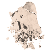
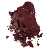
I decided to pass on the Stonewashed Nudes eye palette from Bobbi Brown and get just the darkest color in the set, Espresso, to use with other nude colors that I already have.

And now-The Results :
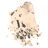
Other than a couple of black eye shadows that I own (by Dior and Clinique), Espresso is the darkest color I've come across in a while. It's truly the shade of a very black coffee, while still technically brown. It's several tones darker than Bobbi's Chocolate, the darkest one in last year's palette, and very pigmented. It needs to be applied lightly, with a good fluffy brush, otherwise you find yourself having to clean up excess powder. I got the hang of it eventually and found it easy enough to use.

A reader has commented on my original post that she had problem blending this shadow. I'm guessing that it depends on the amount you use and on the brush. That's what made the difference for me. It's such a dark color that you have to blend carefully, but once you do, the effect is great. I tried it with several nudes and neutrals: the light colors from the chocolate palette, a delicate beige from Dior's Beige Massai and a few others from Lancome, Benefit and Chanel. It's nice and versatile, and the look created is sophisticated and classy (as long as you don't overdo it. Very little goes a very long way).

Espresso is also great as a liner, used wet or dry, with or without a sealing liquid (I use Paula Dorf's Transformer). I use a flat synthetic brush for lining, and managed to draw a nice just-thick-enough line, for an almost-cat-eye (that doesn't go the Amy Winehouse way).

All in all, this is a good choice to create several of the looks for the coming fall.

Chanel's Aqualumier in Catalina


More lip loveliness for fall: Chanel's Aqualumier in Catalina.

Like all Aqualumier lipsticks, it gives a sheer, weightless coverage that feels almost balmy without the stickiness. My sensitive lips have always loved this formula, and this is no exception. The vitamins and SPF 15 don't hurt, either, but I'm here to talk about the pretty color.

Like just about every Chanel lip color I've ever fallen in love with, Catalina is a limited edition (when I have a favorite that isn't designed for a short life span, they just discontinue it. It's a miracle that Giggle and Summer Plum glossimers are still available). The color is officially described as "deep plum", but since it's sheer it doesn't make my lips purple, and it's more of a reddish, shimmery plum. It would probably be more dramatic on pale face/lips, but on me it's very wearable and doesn't look overdone. It's very appropriate for daytime.

Layering Catalina with Hibiscus glossimer (see yesterday's review) makes for a fabulous, sexy evening look. They give each other more depth than the colors offer separately and are just meant for each other. Also, just as I thought, these two are perfect with the neutral Bobbi Brown eye makeup for fall. I wore them with Espresso, the darkest shadow in the collection (review to come) and loved it.

On Color- Part 2


Part 1 discussed Bobbi Brown's Stonewashed Nudes look for fall 2007 and focused on the eye shadow palette. Now, let's move to lip color.


Last fall we saw the start of the berry lip trend. However, the other makeup craze of smoking up and raccooning our eyes was even hotter, most lips remained nude. The new looks of more neutral colors for eyes calls for amping up the lips, and as someone whose natural lip color is quite strong and would never pull of a beige lip, I couldn't be happier. The new lip colors in Bobbi's fall collection are nice. Especially the three variations on the cocoa team. However, these lipsticks are semi matte and full coverage, while my preference is for a lighter formula.

Next, I looked at Chanel's fall collection. I'm smitten. Completely, totally in love with it. It's balanced, beautiful and has an interesting and mysterious air to it, without ever being over-the-top or clownish. Not that it should surprise any of us. Chanel can do bold colors like blue or green eye shadows and keep the look classy and refined.

There are several options for lip color, including a compact of three glosses that look too pretty to even use. The shades in the Orchidee trio are quite interesting and are meant to be blended and worn together. The plum one looks very dark, but with a neutral eye and blended with the lightest shade in the compact it should look stunning.

There are more traditional offerings in the new fall collection, some additions to the regular line and a few limited editions. I have a serious weakness for Chanel's LEs, so I made my choice from those: I got the sheer lipstick in Catalina (a deep plum) and a Glossimer in Hibiscus (shimmery plum). Look for the full review next week (there will also be a review of a limited edition Chanel nail color).

The eye shadows offered in this collection are equally lovely. The theme here is an autumn garden, which is featured in a variety of green shadow. The stunning four color compact in the Le Quarte Ombre de Chanel series (a wet-dry formula) is a limited edition called Garden Party (the other limited edition, Sequoia, is more neutral). There's also a duo in cactus green and soft pink and even a single named Jungle which is a dark forest green, all are very pretty and they make this color a must-have for fall. The many green variations promise that there's a green for everyone.

Another similar green option was offered a few months ago by Bourjois, which is owned by Chanel. I reviewed their cute eye shadow duo, Petite Guide de Style in Miss Spirit, a dark green/light peach combination that would look equally pretty in the fall as it did last spring.

On Color- Part 1

My post on MAC's C-Shock collection has earned a bunch of comments and many more emails. Apparently, this love-child of Boy George and a parrot managed to seriously annoy people. Still, there are a few fans of these colors, and like Toya has mentioned in her comment, a woman who has dark enough skin can pull some of it off. I know what she means. I own several green and blue eye shadows and wear them often (separately, of course, and blended with neutrals so they only give a little pop of color). However, this collection is too much for me, so I leave it to those who know what they're doing with fuchsia. And to the teenagers who need something to play with while wearing 80s-inspired clothes and dream about being Lindsay Lohan. After all, like another commenter has said, they should be able to do that and learn the hard way. I agree. There's something wrong with a teen who only experiments with Bobbi Brown nudes.

Speaking of which, the complete opposite of the MAC collection is Bobbi Brown's Stonewashed Nudes for fall. The centerpiece of this look is the Stonewashed palette, which is expected to be the new sensation, like its predecessor, the Chocolate palette from last year that was sold out everywhere before July was over, has reappeared on eBay, bringing out insane bid wars and prices. The palette is another brilliant idea: A collection of wearable neutrals in stone, taupe and grey. These muted colors are flattering to almost everyone and create a sophisticated look. The undertones here are cool and instantly transform you away from the warm, bronzed summer hues into a crisp, fall look.

There's no doubt that both this palette and the entire collection are very pretty. The question is, should I (and you) hurry up and buy it before it's gone?
With the exception of the darkest shadow, Espresso (which is my favorite one here), all the other colors are only available as a limited edition in this palette. Out of these special six, the lightest one, Navajo, is too pale to even show up on my skin (just like last year's Bone). Bobbi's shadows are beautiful, but not very pigmented, which makes many of them useless for me. The one other shade in this collection that I would have bought as a single is Rock Shimmer. The other are nice, but I wondered: How exceptional are they?

Surprisingly enough, not all major brands have a selection of taupe and grey washes. There a few here and there, and you may own them. I'd suggest taking a look at your stash to see if you already have what it takes to create the look. If you don't, consider buying this palette. Taking into account that a single Bobbi Brown shadow is priced at $19, a 7-color collection for $50 is a good offer. I decided to only get the Espresso shadow, knowing from experience that this is the one I'll be reaching for the most. I already have a good cream liner that goes with it and several light colors for the lid, so I'm all set.

Coming Next: Lip Color. Glosses and lipsticks that go with the Stonewashed look and the best fall colors.

Tropical Dreams


I really wanted to love the limited edition Sand & Surf eye palette from Bobbi Brown. It’s pretty. It’s shimmery. It almost sings of summer on the beach (okay, the Shore for us, Jersey girls).

But I had to ask myself the question: How many aqua eye shadows does one really need?

The answer, unfortunately, isn’t five.

I had to face reality and admit that Bobbi’s light-colored shadows don’t work for me. They are too pale and too sheer, and in most cases don’t even show on my skin. This collection is labeled as ultra-sheer, which doesn’t bode well for me. Actually, I can't say that I'm too impressed with the way they look on the very tanned model. Too California Girl, not much sophistication.

I also have an issue with the whole suggested "look". You don't need to work very hard to realize that the only new product here is the eye palette. The single shadows (Bone and Banana) are part of the regular collection (and I can't wear either one), just like the mascara (in brown and black) and the gel eye liner (black, sepia and espresso).

To sum it up: I'm disappointed. It's interesting to note that the most sensational limited edition from Bobbi Brown was created around simple browns, while everything since (remember the horrible Orchid face palette?) was seriously lacking in oomph. It's too bad, really, because this beachy theme could have been done much better, and the eye shadows look so pretty. While in their compact, that is.


However, there is a tropical beach look that is as wearable as it is beautiful. Earlier this week, I received the "Beauty Benefits" catalog from Bloomingdale's (the one with the hot pink cover). It's full of pretty little things, but one that really caught my attention was Bronze Tropiques from Lancôme. Now, I don't know if it's actually available at their Lancôme Counter, because it hasn't been officially launched , and the web site only offers a sneak peek. But Lancôme boutiques (or at least, the NYC one) already have it, and I had the good fortune to actually play with them at the Manhattan store.

To my delight, the colors are very wearable and flattering, from the light turquoise shadow in one of the two eye palettes to the pretty Juicy Tubes. There's something for just about everyone in this collection. The bronzing pressed powder comes in two shades. My medium-tan skin tone can carry both, so I guess that it depends on application. The two darkest Juicy tubes (one is more berry while the other is a rich caramel) are great (if you're pale, there are also two lighter ones in peach and pink).

I already mentioned the eye palettes: both are great, one has the aqua color, the other is more conventional, but very pretty and still uses the tropical theme successfully. If eye shadow quads are not your thing, there are two super pigmented loose powder shadows. One is bronze, the other one in a lovely pink hue. Both are extra shimmery. If you’re not afraid of high octane color and have excellent brush skills (unlike me, who would end up with this thing in my cleavage and on my cats’ whiskers), then it’s worth trying.

The collection also includes three lipsticks and a couple of pencil liners. No new Artliner, though.

There was only one (literally) sour note in there. Tropiques is a fragrance that was previously limited to duty free shops around the world, and now brings the glory of mango to Lancome boutiques . I should have known better than to spray something with a tropical name on my fruit-repellant skin. I can’t deal with Escada-like scents. It didn’t sit well with neither my body chemistry, nor with Andy Tauer’s L’Air that I was wearing. As far as I’m concerned, the perfect fragrance to wear with Bronze Tropiques is Monyette Paris. All of the island feel, none of the fruit.

Stuff I will not be getting

The spring look limited editions are already here, and it looks like I'm not the target audience of any of them. So many pretty colors, so few that actually suit me. It's not a big issue right now, but soon enough I'll be getting the itch to update my look, to get something new and very fabulous. It's not going to be easy to find.

Here's what we have so far:

Annie from Blogdorf Goodman has reviewed the new MAC collection (and she has great pictures of it). It looks lovely and totally not for me. Pale, icy, pearly... Not adjectives that describe colors that should go on my face.

Nars Spring 2007 collection offers lots of sheer pinks and frosted shadows (am I the only one who is getting Cyndi Lauper flashbacks from frosted mint green?). Their Corinthe sheer lipstick actually doesn't look half bad. It's a sheer almond and I might have to check that one out. Everything else is for a much lighter complexion.

Smashbox Tokidoki spring 2007 collection (a limited edition, of course) is unbelievably cute, Japanese-inspired and very very pink. One of the shadow quads, Modella, with it's deep purple and peweter colors might have some potential for me, if the lighter shades are pigmented enough to even show on my skin. But other than that, another no go (it doesn't even look good on the model Smashbox are using to show this collection. And she's a blue eyed blonde!).

The good news is that I just saved $50 by not buying the new limited edition Bobbi Brown violet face palette. The bad news is that Bobbi Brown is all about violet this season. Violet is a lovely color. In theory. It just doesn't belong on my face, as I don't do the Three Days Decaying Corpse look. The worst news is that some women are actually going to be sporting the orchid and violet shimmers on their faces.

Shades of Shadows

The infamous GWP incident I had with my most recent Lancome order has given me the opportunity to test a bunch of their eye shadows. I received two compacts- one of 4 Color Focus shadows and the other had two Color Focus and two Color Design. The colors were mostly neutrals, all very wearable and the quality pretty satisfactory. The shadows were easy to apply whatever method I used: brush, finger and even the sponge applicator worked. Still, I prefer to use bushes for the darker colors and apply the highlighters with my finger. It gives the most even coverage without the powdery effect.
All shadows had pretty decent staying power even without a primer and didn't migrate to places they didn't belong.


Honeymoon (Color Focus): This one appeared in both compacts and is a very versatile highlighter. It's a cool toned, very soft shimmer ivory. I wasn't expecting much from a color so light, but while indeed not very pigmented, it has enough presence to actually do some highlighting of my darker-than-average skin. The shimmer is light and subtle, suitable for day, and the color works well as a base. It's much better than Bobbi Brown's invisible Bone.

Gaze (Color Design, Shimmer): Warmer than Honeymoon, it's a light champagne color. I think it's more pearl than shimmer. Very pretty and blends well with browns and bronze. The shimmer effect is still not over the top and can definitely be used during the day.

Suntouched (Color Focus): A light, bronze-touched gold. A warm tone that's probably more suitable for the warmer, tanner months. It has the same kind of light shimmer as Honeymoon, but with this darker color, its presence is more pronounced and I'd advice a lighter hand in applying it. I'd probably avoid it altogether unless I was going for a very bronzed, mid-summer look. But someone with a warmer skin tone might find it more wearable.


Mocacchino (Color Focus): The color swatch from Lancome's website is a bit misleading here. Mocacchino is actually a cool shade, very neutral, and probably more taupe than brown. It's comparable in color to the taupish one from Bobbi Brown's Chocolate Palette, though I much prefer Bobbi's creamier texture and darker pigment.


Dill
(Color Focus): This one is probably my favorite. It's a cool, slightly heathered khaki, with just enough green to bring my eyes to life, but it's muted enough to be perfectly suitable for casual day wearing. It also works great as an eyeliner: I used it with Paula Dorf's Transformer and liked the result (though the green was less pronounced this way).


Lezard (Color Focus): A deep, dark brown color. Very pigmented, works great for darker skin tones. It's good for lining, contouring and adding some drama to the crease. It has some very tiny glitter flecks, that aren't over-the-top, but I'd still advise a light hand, especially if you have a lighter skin tone. This shadow reminds me a little of the darkest one on my Snake Charmer Lorac palette. But Lezard is a tamer one reptile.


Couture (Color Design, Intense); This is a dark, matte chocolate brown, very pigmented and intense. It's very much like the darkest shadow from Bobbi's palette, and since most Color Design shadows have a better texture than Color Focus, it's trully comparable . It's great for a smoky eye look, perfect for lining, and applied sparingly, also very wearable for day.

Charmed

Over a month of using Bobbi Brown's infamous chocolate palette has taught me three things:
1. I really like the almost neutral look for eyes. Most of the time.
2. If you start wearing the new fall look in July, you'll be tired of it come September.
3. Brown is nice and all, but a night out on the town requires a bit more than that.

Which means that I was more than ready for something new. Enter Sephora (or rather- enter me entering Sephora). At first I was about to buy Smashbox' Electric eye shadow quad that I've been eyeing for some time. I'm still coveting a teal shadow, but the gold and the bronze were just a bit off. The gold had too much yellow in it, and the bronze a bit too light and too similar to other things I already have.

Instead, I found Lorac's Snake Charmer face palette. When I saw it online (the picture I'm using here) I wasn't impressed, but I can tell you that the colors in this photo are a bit off. In reality they are deeper and browner, the gold has no greenish undertones and the other colors aren't pinkish. I even liked the blush. It is peachy, but for once not too coraly to make me look like a tropical fruit (I'm not a fan of Nars' Orgasm). It actually looks fresh and flattering.

The shadows have a lot of shimmer without tackiness, the light colors are, indeed, highlighting (my brow bone rejoices) and the royal brown is a perfect evening shadow. It's dark, deep and shimmery and looks absolutely gorgeous. It gave me exactly the look I wanted.

I also have to add that the compact itself is adorable. The snakeskin and little red jewel are cute and different. Much better than the usual black plastic cases you see everywhere.

So there I was, with an almost done face: subtle but festive eyes (I added liquid black liner- my trusted Lancome Artliner), fresh faced, but what about the lips? I needed something different there.


My choice was another Lorac (I was at their stand, after all), Lip Intensity gloss in Daring. It was, indeed, a very daring color. In this case, the sample picture is really true to life. It's a deep wine color that looks bold and intense as promised and is not for the faint of heart or the pale of skin. The texture of this gloss is more like a liquid lipstick. It's thick (needs a bit of practice to get it right), opaque and covers well. I absolutely love it.

Both the gloss and the palette are exceptional in quality. Highly pigmented, applies well and stays put for hours. I'm pretty sure that it's the first time I bought anything Lorac, but it looks like I'll be coming back for more. They have an extensive selection of lip colors and several interesting eye shadows. Sadly, none of them was teal.

In the Shadows

The coming fall is a great season for eye shadow. Everyone is talking about shadows and from the look of it, it seems that everyone is also buying them. The chocolate Bobbi Brown palette has been talked about everywhere, but there are other beautiful options out there. The question is: Do I really need more eye shadows?


I might need a good highlighter under my brow, but as I've mentioned, they are hard to find. Especially non-shimmery ones. I like this trio from Stila. the one in the picture is Forest Clove, but there are two other trios, all look lovely, but the light ones are all shimmery, and until I actually try them on I can't tell if they even show on my skin.


Cargo's Ten Thousand Islands is gorgeous, and has everal optional looks- warm and cold. I love this blue, but I vowed to turn it down a notch for the upcoming season, and I do worry that I'm reaching a certain age that vibrant colors might no longer be apropriate. But it is so beautiful...
I love the slate and silver. These colors do look good on me and might be the thing for an evening look. The ecru and chocolate might be redundant, considering the Bobbi palette.


Looking at this limited edition Smashbox Quad I'm questioning my resolve about bold color. I love the teal, though I'm not sure how well it works with the other colors when it's actually on one's face. Probably as a liner. Can it be considered a fall color/look? Probably not, especially with the yellow gold. This one is something I know that can work on my skin, but I'm uncertain about the whole look for the season. It's more summery, and I already have Chanel's Gold Rush quad.

Looking at all this, I think that I should be looking for a duo compact, definitely not a palette. Hopefully, something interesting would pop out in a month, just in time for the season. Right now, it looks like slim picking.

Brown


Is there a beauty blog that didn't mention Bobbi Brown's chocolate palette lately? I almost missed my chance of getting one, because I was taking my time deciding that I really need some new brown eyeshadows, while these slick things were selling out like crazy.

There's something weird about a new line for fall that is becoming sold out by mid-July, and I wonder what was the beauty blogs' contribution to the Bobbi Rush (or for the Azuree oil craze, for that matter). Are we the ones creating the hype? Bobbi Brown's chocolate cherry nail polish is no longer to be found. It disappeared even faster than the palette. But I've already seen some great alternatives elsewhere. One of the magazines had Christy Turlingtom wearing something similar by Maybelline. I might check it eventually, but right now I'm actually on a light color kick. It's still summer, after all.

But back to the brown shadow issue. We all have them in the depths of our makeup drawers. I have a cognac color from Elizabeth Arden, an earthy brown from Clinique, a Chanel bronze and probably another one or two. None of them were part of a full palette, as brown seems to have gone out of favor in the last few seasons. I preferred shimmery golds and sexy khakis. So, all of a sudden brown looked fresh and new.

I started playing with a sample of Max Factor's MAXeye shadows in Connoisseur. The highlighter part of it, like just about any cream, beige or light mocha shadow I've ever tried, did nothing for me. It just looked dusty. The two darker browns were nice, though. The darkest isn't dark enough to also double as a liner on me, but the colors are blendable and the result was pretty. However, the shadow's quality leaves a lot to be desired. They don't stay put for very long, and depending on the amount of color I applied, they creased and/or faded within a few hours. They don't come with an applicator, which is fine with me. I prefer to use brushes, and the shadows did yield nicely to my brushes and went on well both dry and wet. But, as I said, they fall apart way too quickly.

While this experiment's results were decidedly underwhelming, it did make me decide that I need to invest in a good brown palette. Thanks to Annie from Blogdorf Goodman I learned that Nordstrom.com still had them (though my local store was out of the Bobbis, as were all the other department stores in Paramus) and I managed to score one. Once it arrived, I was really happy that I did.

Again, the lightest color, bone, is completely useless to me. This is the only color from the palette that can be purchased separately. So, if you are somewhat olive-skinned, you don't need to bother with this one. It's invisible. What does work as a nice highlighter is the lightest shimmery shadow. It's very light and has more shimmer than pigment (not in an over-the-top way), but it doesn't need to be more than that, especially for daytime. The darker colors are all very pretty, can be blended and layered to your heart's desire, and the darkest one is just perfect as a daytime liner.

I'm not crazy about the double-ended brush that comes with the shadows. It's too thin for my liking, so I'm not using it.

It's amazing how beautiful this look can be. I seem to have forgotten how well these colors work for me, especially with black liner (I've been working my Artliner ever since I started using this palette) and darker lips (see my new Holy Grail). By the time fall is actually here there'll have to be some new sensation, because I'm already wearing this look every day.