Showing posts with label nail polish. Show all posts

Butter London Nail Polish Yummy Mummy


My initial introduction to Butter London nail polish wasn't a big success, so I gave up on the brands for a very long time. Then I saw some of Amy's swatches on Cafe Makeup resulting in an online shopping spree. This time I was so thrilled with the outcome I was willing to forgive the annoying cap.

As much as I love my reds and purples, when it comes to nail color the right nudes and neutrals thrill me just as much. I'm on a never ending quest for the classiest, most perfect beige. Butter London's Yummy Mummy might be it, despite the annoying name.

Yummy Mummy is a somewhat cool toned beige with the most subtle shimmery finish. It's wedding appropriate, job interview friendly and very pretty. It works with anything and everything and would be the color I buy again and again. The texture is great: no complaints this time, two coats deliver the pretty and dry quickly.

Butter London Aston Nail Polish


I'm in the mood for a somewhat neutral nail polish, but with still enough character to look interesting and fall-appropriate. Aston, has a delicate shimmer in a nice toffee (or rich leather interior?) color. It's on the warm despite some pink undertones, and on my hands looks better on gray days like today than when the sun is in full force. Two coats are enough for a perfectly polished look that goes anywhere and everywhere.

Butter London Tea With The Queen Nail Polish


Sabrina from The Beauty Look Book and I gravitate towards opposite end of the color rainbow except when it comes to nail polish. I have a feeling the content of our polish drawers are eerily similar and both are heavy on classic nudes. We didn't plan this, but it looks like we went on a Butter London online shopping spree at around the same time last month and obviously bought the same things. Case in point: Tea With The Queen.

Seriously, how can a royalty-obsessed like me resist this color? Tea With The Queen is that prim and proper, but also as pretty as they come. Sabrina's skin color brings out more of the subtle pink undertones while on my olive skin it's more of a warm beige (compared to Yummy Mummy which is cooler). I'm perfectly happy with two coats, considering the more time I spend with wet polish the more chances I get to have cat hair stuck to them. But my little trick when it comes to applying a third coat is to do it the next day. It shortens drying time and prevents possible mishaps.

Butter London Dahling Nail Polish


There's something wonderfully retro about Dahling, the deep rose polish with a cream finish by Butter London. It ignores every current trend in favor of exuberant femininity; sometimes this is exactly what I want to wear.

It takes two coats for full coverage, three for bottle-perfect opacity. It took me a couple of attempts to learn the right amount of color that prevents a streaky first coat, making my manicure look instantly better. The last month or so I've been back to using Deborah Lippmann's base and top coats and I'm getting excellent results in terms of longevity and shine maintenance.

Glamor in a Bottle


Chanel has done it again. Remember the waiting list to get on the waiting list for the Black Satin nail polish (now widely available online and at every Chanel counter)?

Tulip Noir, one of the limited edition colors for fall 2007, is already sold out, at least online. This time, as far as I'm concerned, it's for a very good reason. I bought the bottle a couple of weeks ago as an afterthought when I got the Chanel new lip colors for fall. The bottle of metallic burgundy polish looked tempting after all the summer nudes and neutrals I've been wearing for weeks. As much as I love the Glossimer and the sheer lipstick, Tulip Noir is the big winner here.

The picture above doesn't do it justice. The color is rich and very pretty. It gets noticed and I got several compliments on it, from both men and women. How often do men notice your nail polish? And, I have to say, as much as some of those blue and navy polishes that are supposed to be all the rage look pretty in theory and in their bottles, in reality and on one's hands blue polish is not sexy. Red is.

One coat is opaque enough and looks great when you're in a hurry. Two coats bring out the depth. The polish surprised me in its lasting power. Just renew your top coat every other day and it stays on for a week with no chipping. My only complaint is and has always been about the brush in all Chanel polishes. I'm spoiled by OPI's wide brush which has a great handle and is very easy to use. Chanel brushes are tiny, thin and annoying. I have larger than average hands, but that's no excuse, especially for a nail polish in this price range.

As I said above, I can no longer find it online (outside of eBay, that is), but it's worth checking your local Chanel counter to see if they might still have a bottle.

Summer Reading

Summer at Tiffany by Marjorie Hart is a charming little memoir of New York City in the mid 40s. You can almost see and feel the city as it was back then, the excitement and naivete of two Midwestern college girls experiencing the city for the first time. I have a thing for old movies, especially those that were filmed in Manhattan, and reading this book is almost like watching one.

From the front flap:


Do you remember the best summer of your life?

New York City, 1945.
Marjorie Jacobson and her best friend, Marty Garrett, arrive fresh from the Kappa house at the University of Iowa hoping to find summer positions as shopgirls. Turned away from the top department stores, they miraculously find jobs as pages at Tiffany & Co., becoming the first women to ever work on the sales floor—a diamond-filled day job replete with Tiffany blue shirtwaist dresses from Bonwit Teller's—and the envy of all their friends.

Hart takes us back to the magical time when she and Marty rubbed elbows with the rich and famous; pinched pennies to eat at the Automat; experienced nightlife at La Martinique; and danced away their weekends with dashing midshipmen. Between being dazzled by Judy Garland's honeymoon visit to Tiffany, celebrating VJ Day in Times Square, and mingling with Café society, she fell in love, learned
unforgettable lessons, made important decisions that would change her future, and created the remarkable memories she now shares with all of us.


It will make you want to try on one of the Tiffany blue nail polishes reviewed in Blogdorf Goodman last week. I don't think I can pull of this particular look, but the colors are gorgeous. I think they look best against pale skin.


For those who share my love of NYC memoirs and wish to read something a bit more literary, Here's one of my most favorite books of all time: Manhattan Memoir by Mary Cantwell.

Mary Cantwell was a fashion writer for several magazines. Her three-part memoir covers her New England childhood and her adult years as a working woman in Manhattan of the 50s and 60s. The book is beautifully written and pulls you into her world.

I'm quite fickle when it comes to nail polish colors, which is quite obvious by looking at my ever growing collection. However, this one stands a chance to become a perennial favorite for summer. OPI's Innsbruck Bronze from their classic collection is a frosted rosy bronze. The finish is modern and not too pearly (though more so than the picture lets on), the color is bold enough that if you're in a hurry, one coat would do. It's an elegant neutral that's still very summery and would look good on just about anyone.

I'm finding myself using it more often than any of my other summer favorites. The excellent OPI brush doesn't hurt, either.

I'm not commenting on the class and grace, because, really, it's Fergie. The thing that caught my eye was her nail polish. It's yellow. I don't know about you, but the thought of yellow talons doesn't work for me.

Lost and (almost) Found

I'm not going to try counting the number of nail polish bottles that I have in various drawers and boxes. I buy and wear many of the new colors of each season. I seem to collect Essies, OPIS and Lippmans, limited edition Chanel and the occasional Lauder or Lancome. I used to love the Anna Sui polish when it was sold in Sephora. I'm also prone to purchasing many of the drugstore brands, if a specific color catches my eye.

In such a collection, it is rare that any bottle is used till it's finished, and even less likely that I get to actually repurchase a color.

Except for two.


I 've gone through several bottles of As Time Goes By from the Lippman Collection before it was discontinued. It was simple labeled "true beige" but was more of a cafe au lait color. A perfect nude as far as I was concerned, and I was very disappointed when they stopped making it. A good alternative from this (excellent) line is Fashion, a new taupish color, pretty, sophisticated and neutral.

My other all-time favorite comes from the other end of the price scale. I have no idea how many bottles of Sally Hansen Maximum Growth in Pure Putty I've used in recent years. This is another nude, but on the pink-mauve side of things. I loved it equally on my hands as on my toes, and the quality and lasting power is impressive for a product that costs less than $4.

A while back it vanished from the stores around here. I searched Target and every drugstore and discount store in the area, and was ready to mourn another beloved color that was unjustly retired to the pink and glossy pastures. Suddenly last month I found it again, and it seems to be back in production. However, they changed it a little. Pure Putty is more pink and less mauve now. It's still quite neutral and appropriate, but just a tad sweeter. I can live with the change.

Someone needs to tell Ashlee that the black nail polish thing is over.

For the Pink-Challenged


Spring might not be in the air just yet, but beauty spring fever most certainly is. I can't do away with my coats, but springifying my nails is a good way to cheer one's soul. The problem is that the ultimate spring nail color is girly pink, but way too many of the obvious hues and tones tend to look awful on my hands.

My olive skin looks better in either very warm pinks (with a touch of coral) that are more summery, or in mauve-based tones. Essie has a perfect one: Spritzer (#365) is a muted warm mauve-pink. It's a great everyday shade, always aproppriate and very pretty. One coat is good enough (and looks more pink and bright), a second coat gives the exact color you see in the bottle.

Speaking about the bottle: The color is less pearly than it looks in the bottle, especially when a second coat is applied.

Still in the Dark


So, how many people were at the Chanel counter today to pick up their Black Satin polish? I wasn't there, because I'm quite happy with my little less goth look, which this week is courtesy of Estee Lauder. I got my Dark Chocolate polish, and have been wearing it since Thursday.


It's a red based brown, less chocolatey than I had hoped for, but dark and on the vamp side. It required three layers to get the depth of color that can be seen in the color swatch from their web site, and in applying it felt thinner than the Essie polishes I've been wearing lately. But it might be because of the base coat I'm using (OPI's Start to Finish)


The other problem with this polish is its lack of sheen. It absolutely requires a top coat, because it gets dull in a matter of hours. I'm still wishing for a polish that has a milk chocolate look, but it would do for now. It does look pretty, even if my husband couldn't see the difference between this one and Essie's Wicked.

Into the Dark


October is nail polish month at Blogdorf Goodman. We all seem to be going darker and darker, though I'm still not caving in for anything black. It looks like I'm not the only one who was seduced by the powers of Essie's Wicked. I've blogged about it last week and have been sporting it since, just like the Beauty Addict. It's the darkest color I've ever worn on my nails, and I absolutely love it. It's definitely more elegant than goth, which is a very good thing once you're of a certain age. I second Kristen's advice about keeping nails short. The color has more than enough personality by itself, no need for milage.

The other color I bought last week was Essie's Double Dip. I was hoping for a chocolate, but the color sample on the site was misleading. It's a pretty metalic medium red, that today looks very nice on my toes. But it's definitely not what I was looking for. So in my quest for that perfect brown, I'll be trying next Estee Lauder's Dark Chocolate.

Nailed


The goth guy who bagged my groceries at Whole Foods the other day had something in common with many beauty obsessed ladies these days: He was wearing black nail polish. I doubt that he shelled a hefty sum to bid on a bottle of Chanel Black Satin on eBay, but nevertheless, that was shiny black polish.

Nails haven't been this dark since Chanel made everyone crazy with Vamp (also sold out everywhere, albeit temporarily). The first hint of this was back in July, when Bobbi Brown's limited edition Chocolate Cherry polish was sold out even before the chocolate eye palette. A look at drugstores in my area confirmed that those deep browns were gone even from the less hyped brands. I couldn't find even one bottle of anything dark enough for this trend.


Thankfully, we'll always have online shopping. Earlier this week, beauty.com still had a nice selection of very dark colors. I bought Double Dip and Wicked (very similar to the infamous Vamp). By now they're already out of many of these colors (including their black, Licorice).

My Adventure at the Chanel Counter


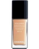
‘Tis the season for new makeup, new looks and the general renewal. Combine that with my sister’s upcoming wedding and you see why I was heading to the Chanel counter at Saks. Well, my formal excuse was that I was running out of my beloved Vitalumier foundation (in beige. I’ve never had a foundation that matched my skin tone so well). Also, I’ve come to realize that the dark under eye circles have won permanent residency on my face and are about to apply for citizenship, so with a special occasion looming ahead there might be a need for a good concealer.

The Chanel lady insisted that I try a stick concealer. I’m not a fan of those, because they are just too heavy for my under eye area. But I relented. It was awful. Even the warmest beige turned ash grey on my skin (that’s what green undertones would do to you) and it was cakey and pasty, setting into the skin in a way that aged me 20 years, and not in a graceful way. The thin barely-there crow feet became instant wrinkles.

A quick clean up and my friendly (but tired and not very interested) Chanel lady has produced the liquid stuff. Medium beige, and this time it was the right color, right texture, just a dab erased the green and I was happy enough to start playing with the new eye shadow palette- Goldrush.


I’m usually a bit skeptic about shadows so light- too often they don’t have enough pigment in them to actually show. But these were great. I can use the gold and bronze for evening and the shimmery pink and beige for day. It’s the kind of pretty that makes you happy.


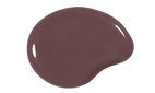
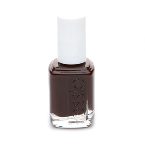
While the helpful lady was at the back I checked the Glossimer and nail polish. The nail colors were not for me- one too coraly and the other one too shimmery. I did get the Glossimer in Summer Plum. It only adds a hint of color to my naturally dark lips, but again with the pretty.

Then came the disappointment- they were out of the concealer. Unfazed, I paid for my other products and went across the mall to Bloomie’s, where I’ve learned that Chanel have actually discontinued their liquid concealer. You can still find it at a few stores and online retailers, but the formal Chanel retailers (like gloss.com and others only offer it in one color- roselight, which I suspect that is very wrong for me. I ended up getting my medium beige from beutifulperfume.com. It’s the first time I’ve bought something from them, so I opted to pay with PayPal. We’ll see how it goes.

That was my Chanel adventure. It reminded me why I don’t like cosmetic counters, but sometimes they are necessary evil, since my local Sephora (and the other one I frequent more, near my husband’s Union Square office) don’t carry Chanel, so I can’t experiment on my own.

And on a side note, the big online stores need to improve the way colors and textures are displayed. What you find at Chanel’s is so 1999. Lancôme’s web site is way better in this regard.